Semantics and Symbols: Examples of Unicode Symbols Usage
This page is a misc collection of short expositions on Unicode symbols semantics and usage.
Unicode Symbol for See, See Also
Decided to adopt a new Unicode symbol usage. On my site, i have hundreds links of the form: (See: link title.)
. So, a article may have lots “(See: …)”, sometimes a few in a paragraph. It gets annoying. I decided to replace the “(See: …)” with just “(➲ …)”, and get rid of the ending period.
Note that the Unicode char
- ➲ (U+27B2: CIRCLED HEAVY WHITE RIGHTWARDS ARROW)
It displays fine by default in all major browsers. This is a important point to consider when you want to adopt some Unicode char. 〔see Unicode: Arrows → ➵ ➛ ➲ ➤〕
Originally, i thought of using a eye icon. The one that i found are:
- 👀 (U+1F440: EYES)
- 👓 (U+1F453: EYEGLASSES)
but these characters are new in Unicode 6, and they do not show in browsers except Firefox on my machine. Also, they don't really fit. The eyeglasses is OK but in normal sized font it's illegible. Then, i thought of using
☞ U+261E: WHITE RIGHT POINTING INDEX
This char shows up but again not legible without larger font. This is a important point, because it ruled out many other iconographic symbols. I don't want to use HTML markup to enlarge the font, because that adds bulk and complexity and is distracting.
Then i thought of using a Egyptian eye icon.
- 𓂀 (U+13080: EGYPTIAN HIEROGLYPH D010) 〔see Egyptian Hieroglyph 𓂀〕
It is quickly ruled out because none of them shows up.
Then i thought of just using a arrow, like this: (→ Syntax Design: Unicode Matching Brackets as Delimiters), but that left paren and the arrow combo made it look like a emoticon. This is another interesting discovery. This means, certain sequence of symbols may create out-of-context side-effects that you want to avoid. (similar to the rise of ligatures)
So, in the end, i thought some other arrow might work. Thus i ends up with ➲. This is not the final choice, i might change it to something else in the future.
Why do i change the more clear “(See: …)” to a icon? It's not a critical change, nor a necessarily one. The change does not matter much to readers (in fact, probably reduce the meaning of the text a tiny bit. (because when you use English word “see”, the meaning is clear and the usage idiomatic. But with a symbolic icon, it became rather cryptic.)). But the advantage with the change is that it makes the text more systematic, and amenable for parsing. (kinda like a micro markup)
2013-08-15 addendum. I decided to use this
- ☛ (U+261B: BLACK RIGHT POINTING INDEX)
2014-08-14 addendum. I decided to use this
- ➤ (U+27A4: BLACK RIGHTWARDS ARROWHEAD)
change'd my site's “see also” unicode marker from [☛ link] to [➤ link]
the impetus of my change is that, on the “Motorola Xoom tablet” Buy at amazon , the pointing finger ☛ isn't showing. Btw, that is traditional symbol for index, and also carries the semantic of See Also. but fell out of use as a standard printer's punctuation. (you can read about it on wikipedia)
since it's not showing, i changed to the arrow thing ➤ instead. The advantage is that it more intuitively indicates to modern readers as a “see also” mark. And shows in all devices, as far as i know. The shape is simpler than the pointing index finger, so shows more clearly in devices. The minor disadvantage is that it doesn't have the classic semantic of “See Also”.
Use of Unicode Subscript Digit Characters
Found a new use of Unicode subscript characters. These: {₀ ₁ ₂ ₃ ₄ ₅ ₆ ₇ ₈ ₉}. In many of my web articles, they are divided into several pages. For example, titled: “Algorithmic Mathematical Art (page 1)”, and the second page would be titled “Algorithmic Mathematical Art (page 2)”, etc. I find those “(page 1)” etc too verbose and distracting. Now i just use subscripts. Like this:
- Algorithmic Mathematical Art
- Algorithmic Mathematical Art ₂
- Algorithmic Mathematical Art ₃
Am not completely satisfied. I think i should add a subscript “p” there too, like these: {ₚ₁ ₚ₂ ₚ₃}, so it makes the semantics more unique. With just subscript digits, it's still too syntactically ambiguous, because subscript digits could appear in lots other places for different purposes. But for now, i'll let it be.
as of today, i've reverted. Using the subscript does not work in some tablet or mobile phone, and is too much in-your-face, have problem with search engines.
Unicode use: The Wave Dash 〜
This is the nth episode of Xah's rectification of typographical convention!
〔see The Writing Style of Xah Lee (2010)〕
〔see The Moronicities of Typography: Hyphen, Dash, Quotation Marks, Apostrophe (2007)〕
Today, i decided to use the Unicode WAVE DASH 〜 for date range.
- 〜 (U+301C: WAVE DASH)
Traditionally, it's done by a EN DASH –. However, it has ambiguity problems with hyphen and minus sign. This is especially important in scientific contexts. Quote from Wikipedia Dash:
The Guide for the Use of the International System of Units (SI) recommends that when a number range might be misconstrued as subtraction, the word “to” should be used instead of an en dash. For example, “a voltage of 50 V to 100 V” is preferable to using “a voltage of 50–100 V”. It is also considered inappropriate to use the en dash in place of the words to or and in phrases that follow the forms from … to … and between … and ….[9][10]
The sources [9] [10] are:
- Copyediting: A Practical Guide
- By Judd, Karen. Crisp Publications.
- Buy at amazon
- Webster's new world English grammar handbook
- By Gordon Loberger; Kate Shoup Welsh. New York: Hungry Minds.
- Buy at amazon
A couple years ago ~2009, i tested in browsers about displaying the wave dash. At the time, some browser doesn't show the char. But today, all major browsers do. At the time, i decided to use the FIGURE DASH ‒ for date range. Now, i replaced all of them on my site to the wave dash. About 480 occurrences.
For examples where date range happens a lot, see:
Incorrect Glyph in Font for Wave Dash
Note that the wave dash 〜 should go up first then down like a long TILDE ~. However, there was some mixup in the character history among encodings, so that some font design got the character inverted. For example, here's Arial Unicode MS 〜. (you can see it only if you have font “Arial Unicode MS” installed.)
Use of ALMOST EQUAL TO ≈
Also, i often use the TILDE ~
- ~ (U+7E: TILDE)
in front of a year to indicate approximate date or quantity, for example, {“I use Dvorak layout since ~1993”, “Place a ~5 ㎝ thick book in front of the keyboard”}. I've been trying to find a proper symbol for that. The closest is the
- ≈ (U+2248: ALMOST EQUAL TO)
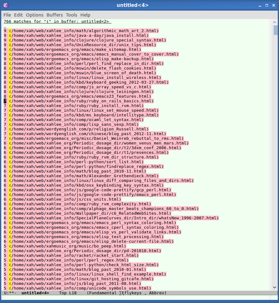
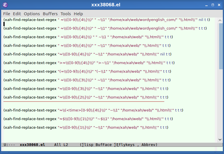
But am not sure about that because that symbol should between 2 quantities, as a relation, in some strict sense. Anyhow, today i decided to adopt this symbol in front of a date/number to indicate approximate/in-exact date/quantity. Not completely satisfied, but it's still better than the promiscuous tilde. For files with several use of ≈, see:
Unicode Approx Equal ≈ vs Tilde ~


Unicode Characters for Centimeter
Discovered special Unicode chars for Centimeter.
- ㎝ (U+339D: SQUARE CM)
- ㎠ (U+33A0: SQUARE CM SQUARED)
- ㎤ (U+33A4: SQUARE CM CUBED)
Note: cm is used a lot in Taiwan, but not in USA. In USA, if metric length is used at all, it's more common to see millimeter (mm).
Unicode, Encoding, Escape Sequence.
- Unicode Symbol for “e.g.” (exempli gratia)
- Semantics and Symbols: Examples of Unicode Symbols Usage
- Unicode Ellipsis vs Triple Dots
- Programing Language: ASCII Char Jam vs Unicode (2011)
- Syntax Design: Unicode Matching Brackets as Delimiters
- Unicode Semantics: the ∀ in Turn A Gundam
- URL Percent Encoding and Unicode (2010)
- URL Percent Encoding and Ampersand Char
- Semantic of Symbols: HTML Entities, Ampersand, Unicode