CSS: Length Units
Pixel Unit
px-
Pixel. Practically, 1/16 of default font size of a device.
Relative Units
lh-
The computed value of the line-height property of the element on which it is used.
🛑 WARNING: the size of actual line height may differ based on their content, e.g. contain words with large font size.
rlh-
Line height of the Root Element.
vw-
1% of the view port width.
vh-
1% of the view port height.
vmin-
Smaller of
vworvh vmax-
Larger of
vworvh %-
Percent. Relative to parent element. Exact meaning depends on the element it is used. 〔see CSS: Percentage Value〕
Font Based Units
cap-
Height of capital letters of the current element's font.
rcap-
Height of capital letters of the Root Element.
ic-
Height of Chinese character for water 水 of the current element.
ic-
Height of Chinese character for water 水 of the Root Element.
em-
Font size of parent element.
rem-
Font size of Root Element. Equivalent to 16px.
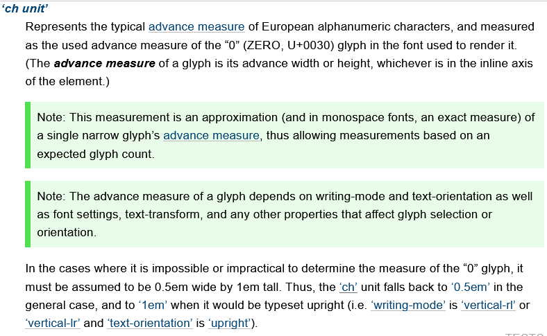
ch-
Width of digit 0 of current font. If writing direction is vertical, it is the height.
rch-
Width of digit 0 of font size of Root Element. If writing direction is vertical, it is the height.
ex-
Height of lowercase letter x of current font.
rex-
Height of lowercase letter x of font size of Root Element.
Physical Units
cm-
Centimeter.
mm-
Millimeter.
in-
Inch.
pt-
1/72 of a inch.
pc-
1/6 of a inch.
Which unit to use
🟢 TIP:
I recommend use only the px unit, and the following:
emorch→ for local font sensitive size, e.g. margin, padding, box round corner.
vw,vh,vmin,vmax→ for layout control.
Do not use
- percent
%, because the meaning depends on the HTML element.
Example: CSS Length Unit
div {margin:1rem}
🛑 WARNING: There must be no space before the CSS unit, and a unit is required, except when the value is 0, else it's syntax error.
rem, Root Font Size
The length of rem is:
The
computed value
of font-size of the
Root Element
.
When used as value on font-size property of the
Root Element,
rem refer to the property's initial value. (in browsers, it's 16px).
🟢 TIP: think of rem as the default font size, and it's basically always 16px.
em
The length of em is:
emis equal to the computed value of thefont-sizeproperty of the element on which it is used. For example, if you saymax-width:50emon a paragraph, it means, 50 times the computed value offont-sizeproperty of the paragraph.- If
emoccurs in the value of thefont-sizeproperty itself, it refers to the computed value offont-sizeof the parent element. - If used on the Root Element,
1emequals to thefont-sizeproperty's initial value (which is16px).
ex, x-height
ex is equal to current font's “x-height”, usually the height of the letter x. Typically about half of em, depending on current font.
Like em, the length of 1ex depends on parent's font-size.
ch
ch is equal to the box width of the digit 0 (ZERO) character of the current font. It is about the same as half of em.
vw, vh, vmin, vmax
vw-
Equal to 1% of the initial containing block (the view port). It does NOT include the scrollbar width. When browser window changes size,
vwalso changes.🟢 TIP: One great use of
vwis to specify height as a percentage of width. You can't do this with percentage. 〔see CSS: Fixed Aspect Ratio〕 In fact, it's useful to replace almost all CSS: Percentage Value byvw, because the meaning of percentage is different for each CSS property. vh-
Equal to 1% of the height of the initial containing block.
vmin-
Equal to the smaller of vw or vh.
vmax-
Equal to the larger of vw or vh.
cm, mm, in, pc, pt
cm-
centimeter. 10 mm → ~0.3937 inch; ~37.795 px
Physical units such as
cmis useful for specifying printed style. For example:@media print { table {font-size: 4cm} } mm-
millimeter. 0.1 cm → ~3.78 px
in-
Inch. 6 pc. 72 pt. 96 px. → 2.54 cm
pc-
1/6 inch. 12 pt. 16 px. “pc” stands for “pica”. → ~0.423 cm
pt-
1/72 inch. (~0.0138 inch) ~1.33 px. “pt” stands for “point”. → 0.3527 mm
What is CSS's Default Unit?
- There is no default unit. Omitting unit is syntax error.
- You can omit unit only when the value is 0.