CSS: Round Corners
border-radius Property
Use border-radius to create round corners.
border-radius is a shorthand for the following properties:
border-top-left-radiusborder-top-right-radiusborder-bottom-right-radiusborder-bottom-left-radius
Round corners
.xround-yrncf {
 width: 100px;
 height: 100px;
 border: solid 3px grey;
 border-radius: 10px;
 padding: 8px;
}
Example
Example. Circle
use 50% to make it circle, for any square size.
Different Radius for Each Corner
Border radius can be specified for some corners only. The order is:
border-radius: topLeft topRight bottomRight bottomLeft
Omitting border-radius Values
Any of the 4 values of border-radius values can be omitted.
2 Values (topLeft bottomRight, topRight bottomLeft)
border-radius: x y
is same as
border-radius: x y x y
3 Values (topLeft, topRight bottomLeft, bottomRight)
border-radius: x y z
is the same as
border-radius: x y z y
Example. Left Bracket for Quote
something in the water, does not compute
from a song lyrics by Prince.
.quote-bracket-234 {
 all: revert;
 border-left: solid 2px red;
 border-top-left-radius: 8px;
 border-bottom-left-radius: 8px;
 padding-left: 8px;
 margin-left: 16px;
}
Border Radius with Elliptical Corner
each border radius value can be a fraction, like this:
border-radius:50px/10px 0 0 0
The 50px specifies the horizontal radius of a Ellipse, the 10px is the vertical radius.
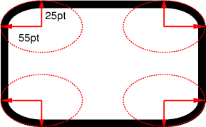
border-radius:55pt/25pt
(image source http://www.w3.org/TR/css3-background/#the-border-radius)
Example
50px/10px
.br-frac-448 {
 border: solid 3px grey;
 border-radius: 50px/10px;
 width: 100px;
 height: 100px;
 margin: 10px;
}
50px/10px 0 0 0
.br-frac-174 {
 border: solid 3px grey;
 border-radius: 50px/10px 0 0 0;
 width: 100px;
 height: 100px;
 margin: 10px;
}
Browser Support
All major browsers support it since 2012.