Monospace Font Review 2025
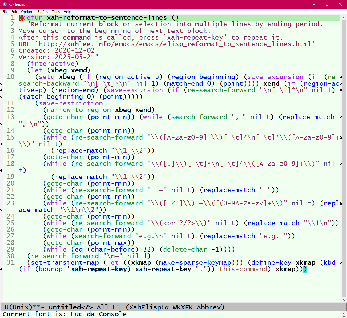
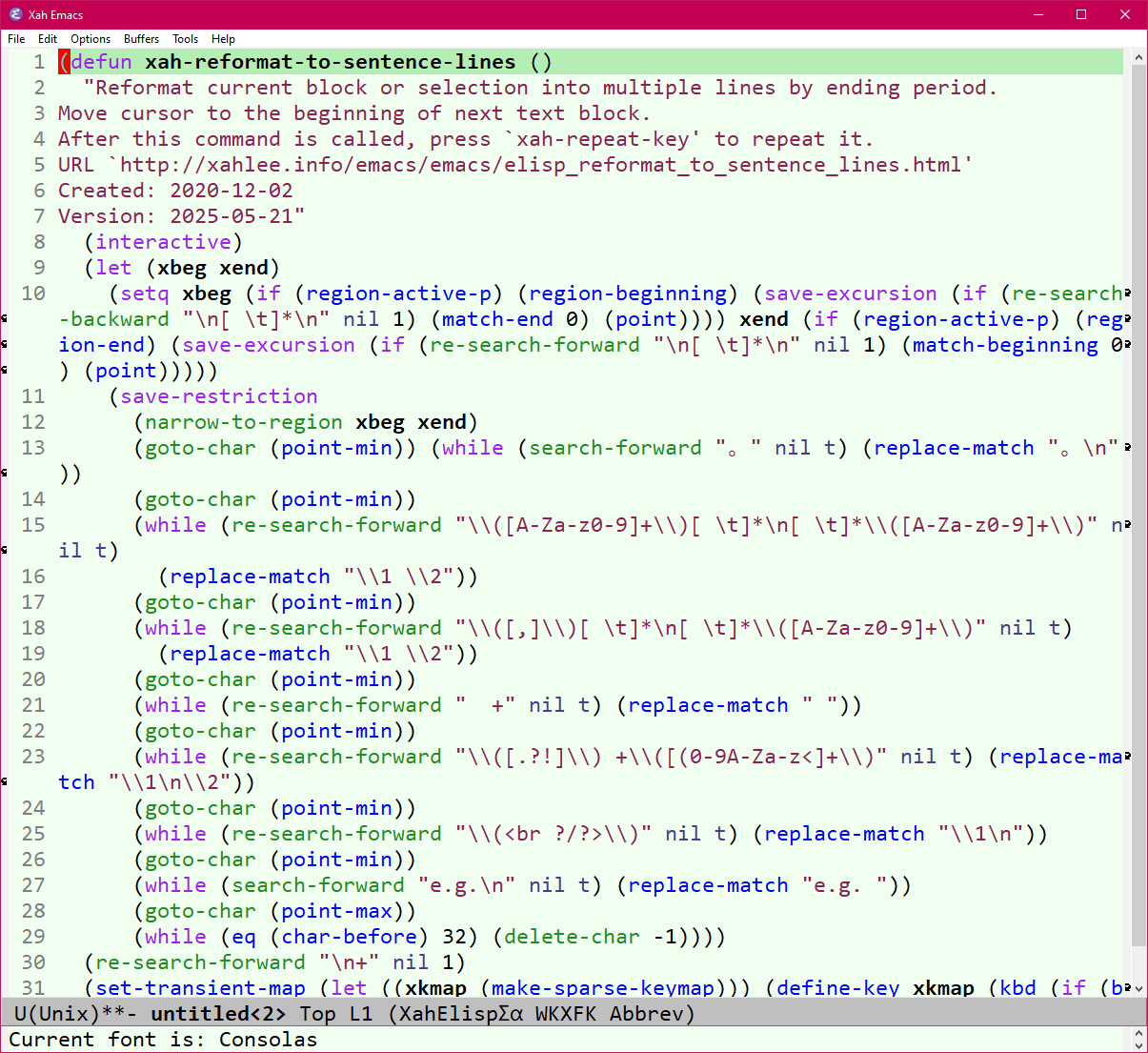
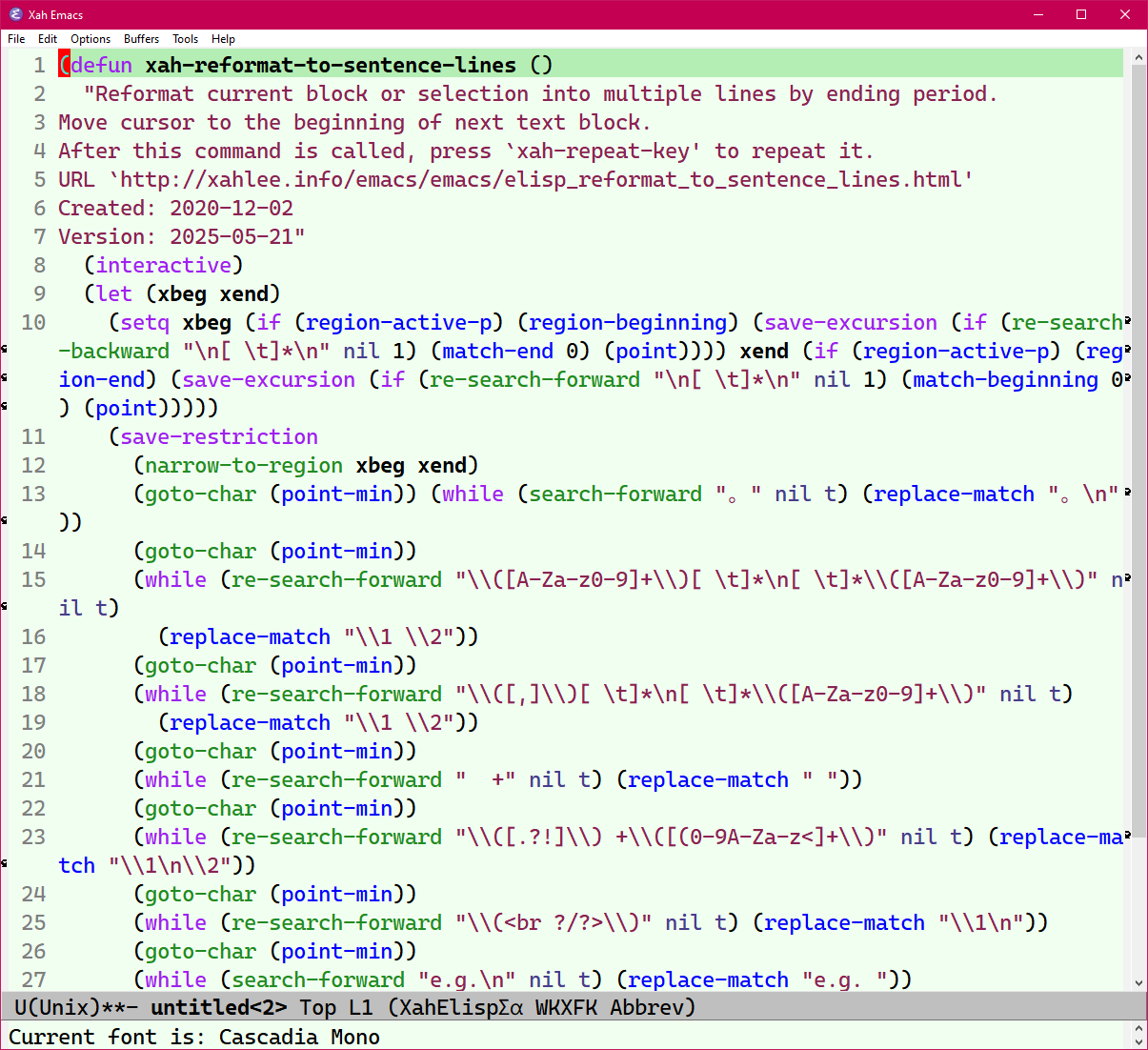
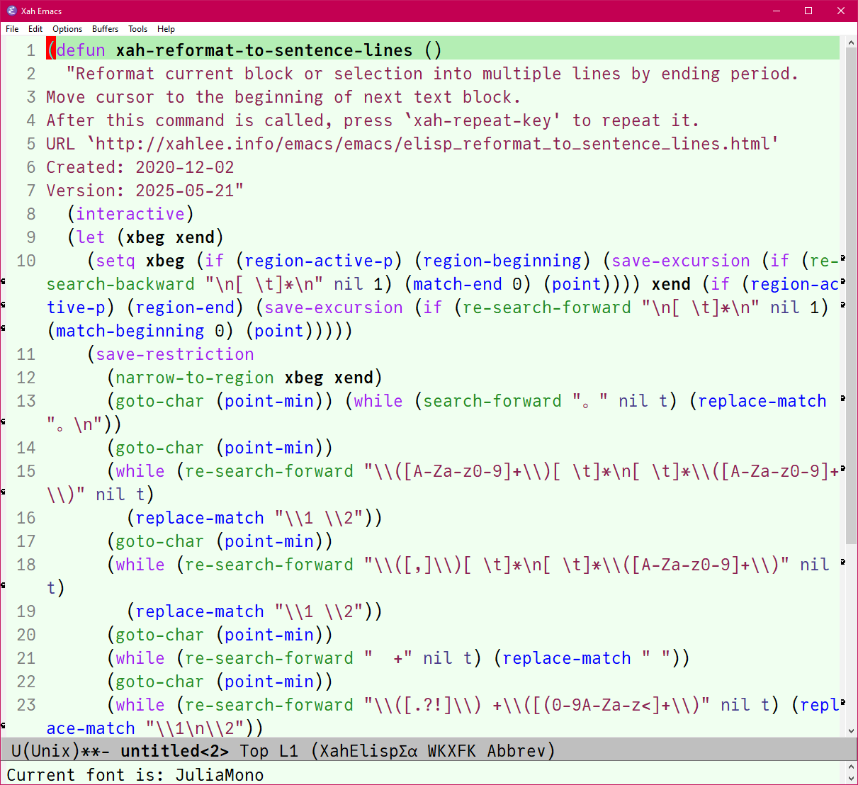
Font Comparison. Lucindia Console, Consolas, Cascadia Mono, Julia Mono
Font Review 2025
Massive font geeking in past days 10 hour spent on studying font. I do so every some 5 years. Lots asking ai and research and test in emacs.
now my default font for emacs is:
- on Microsoft Windows is
Consolas. (wasCascadia Mono) - on Mac is
menlo. - on linux, 10 years ago it was
DejaVu Sans Mono, probably remains.
here's some random notes.
First, important to know what is the default monospace font in operating system. Because default is almost always the best. And you no have to diddle.
- Microsoft.
Lucida Consolefrom year 2000 to 2011. - Microsoft.
Consolasfrom 2007. - Microsoft.
Cascadia Monofrom 2019. Open Source. - macOS.
Menlo(since 2009)
About line spacing, important for coders. Small line spacing let you see more lines per screen.
Lucidia Consoleis the best in least line spacing. But it has a problem of not putting a dot or slash in 0.Consolasis the second best.Cascadia Monohas more line spacing than Consolas.JuliaMonois no good. Big line spacing.
What about Unicode characters, math and tech symbols.
DejaVu Sans Monobegin this trend around 2010.JuliaMonois renowned for the most unicode characters.- However, these days, font substitution tech in robust. also, in emacs, you can set symbol font and emoji font specifically.
- Most fonts for code today includes all the hundreds of math and tech unicode characters. All the basic ones you need.
What about Font with Programming Ligatures
i think they are no good.
Font showing lowline character connected
- Annoying that most modern fonts shows the low line char
_connected. - This is a problem if _ is used as operators,
______you want to be able to tell how many are there.
Lucindia Console
- after more experiment, now am back to Lucindia Console, on windows.
- it has the most compact line spacing.
- i get to see 5 extra lines in my typical window height.
- it has a feel of compact n dense. i like it.
Back to Consolas
after a week, am back to to Consolas (when on Windows)
Lucida Console is too tight and squarely, that seems lines look the same.